
Index

Designing a web app from an Excel spreadsheet to make agents’ work more efficient

French Ministry of the Economy

3 months

Refonte ergonomique

Design d'interface

Application métier

Case study overview

Answer

Best viewed on a larger screen!

Context

The General Secretariat of the French Ministry of the Economy launched a plan to modernise its operations through cultural change, digital transformation, and infrastructure upgrades. To track the actions being implemented, a performance indicator index was created in an Excel spreadsheet.

However, Excel lacks essential features: multiple users cannot edit the document simultaneously, there is no permissions system, and so on. This is why the Transformation Lab, of which I am a member, was asked to create a dedicated web interface.

Problems to solve

Seul designer missionné sur ce projet, je vais designer de zéro un nouvel outil.

Le document de travail actuel n'est pas optimisé pour les tâches des agents sur ce projet, Excel n'étant pas conçu pour ça. L’objectif de ma démarche : répondre plus précisément aux besoins des agents en créant une interface réellement adaptée.

En analysant le document et en parlant avec les utilisateurs, voilà ce qui en ressort :

Readability

Agents have to navigate a large amount of data presented in an unsuitable format.

Efficiency

They waste time on repetitive, manual tasks due to a lack of optimisation.

Errors

The lack of rules and safeguards in Excel creates a risk of handling errors and data loss.

How can we make a large amount of data easier to read every day?

1. Reorganising information

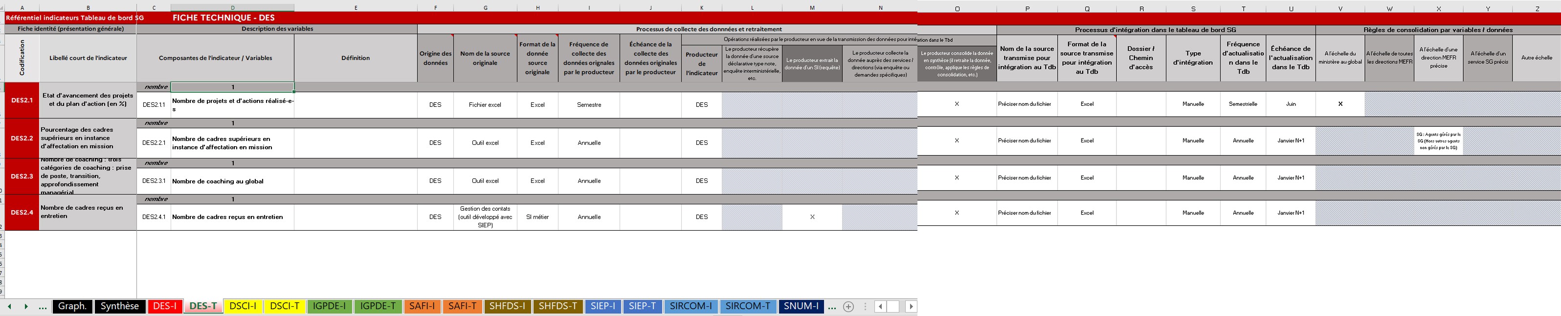
The spreadsheet format requires users to scroll horizontally across very long rows. Each row is difficult to scan during everyday use, and essential information is sometimes hidden at the far end.
Since the data is not intended to be compared from one indicator to another, this format is unsuitable. I designed a hybrid layout that only requires scrolling in one direction and makes it much easier to get an overview.

2. Reducing cognitive load

By deprioritising information that is less important in everyday use

and would otherwise take up space and make scrolling less efficient.

By making the application easy to scan

Clear hierarchy and grouping through spacing, contrast, and type sizes; icons that support quick reading; a streamlined UI; and consistent visual design.

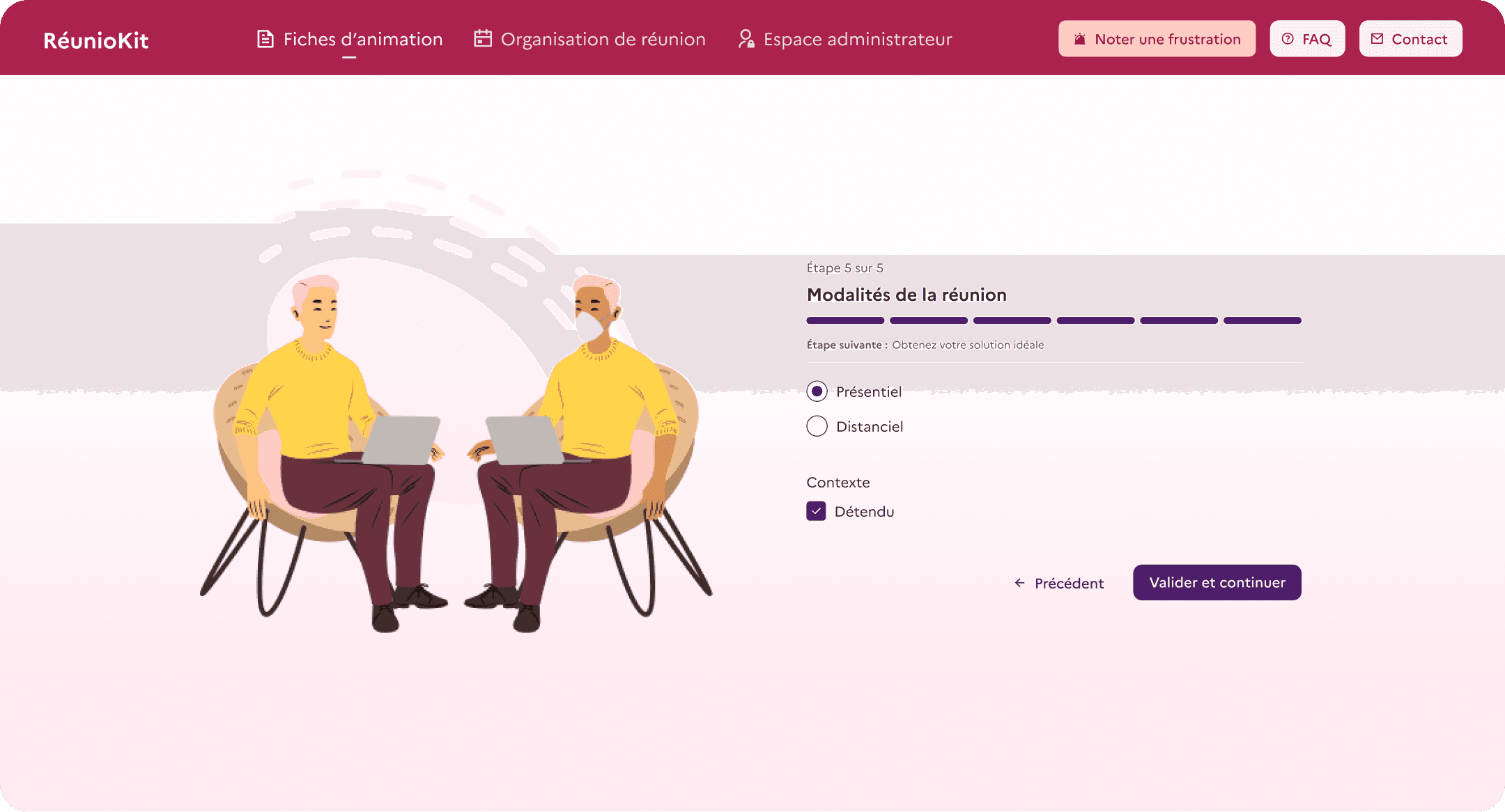
By designing a multi-step form

Less visually overwhelming and more fluid than manually filling in a new row in Excel.

How can we make the process more efficient?

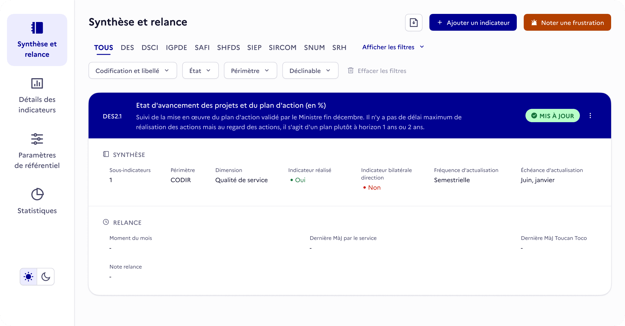
1. Automatically displaying and updating an indicator’s status

An indicator’s status is essential information and is visually prominent in the application. It depends on the date of its latest update and the deadline for updating it again. In the Excel spreadsheet, this status was not displayed explicitly. Users had to manually check the different columns that determined it to find out whether they needed to take action.

2. Providing search filters

It is, of course, possible to create filters manually in Excel, but not every user thought to do so. Here, I displayed the relevant criteria directly, helping users find indicators more efficiently or sort them for a particular task—for example, identifying which indicators have not been updated.

3. Simplifying data entry

In the original working document, users often had to enter every piece of information manually—even when the available choices should have been limited. Wherever appropriate, I replaced text fields with dropdown menus, selectable chips, and other suitable controls.

How can we prevent errors?

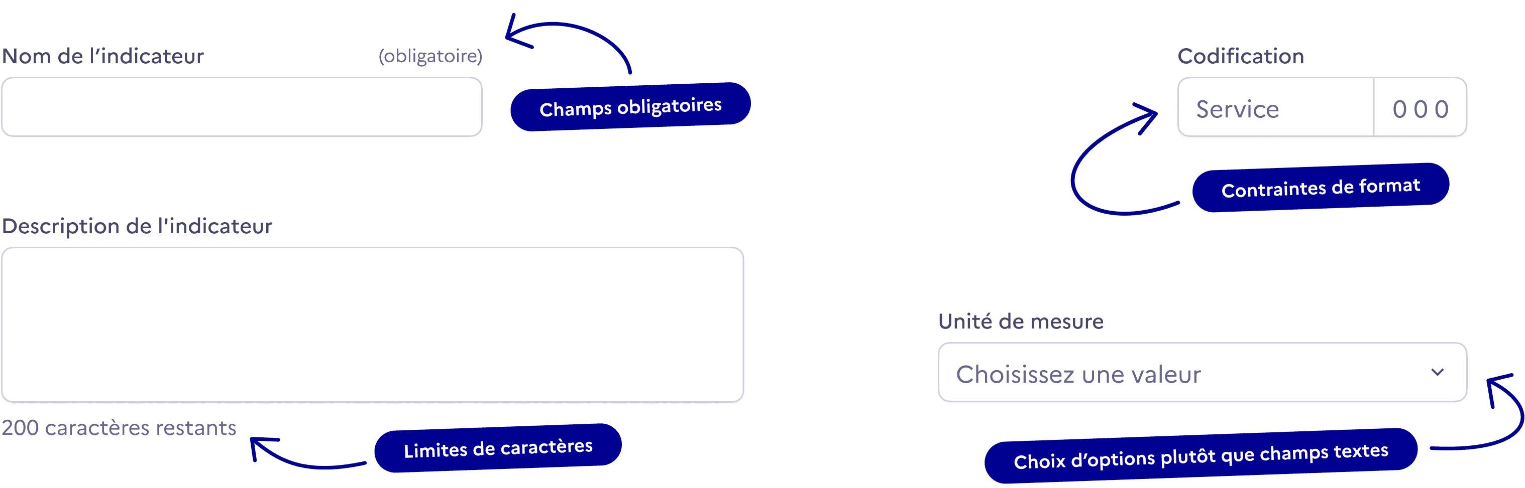
1. Adding validation rules

To improve consistency, simplify data processing, and prevent errors:
2. Protecting data integrity

Outdated indicators and sub-indicators can be archived and hidden to improve readability, while their data is preserved.

This goes hand in hand with a dedicated interface for administrators, who can add or archive options used to define indicator attributes.

3. Adding friction to certain actions

Such as archiving an indicator or leaving the creation form.

Creating a UI kit

The French government has its own Design System. However, at the time of this project, it was not well suited to our needs, as it was primarily designed for government websites rather than applications.

While designing the application, I reused as many elements from this Design System as possible—including icons, the Marianne typeface, accent colours, and certain components. I also took the opportunity to create Transfokit with future reuse in mind.

I created flexible components using Component Properties.

Design tokens, light/dark modes

User testing

Once the first version of my design had been developed, I conducted task-based user testing to assess how well users understood the interface, how easy it was to learn, and how effectively the solution worked.

The identified improvements were implemented before launch, and the tool has since replaced the existing solution.

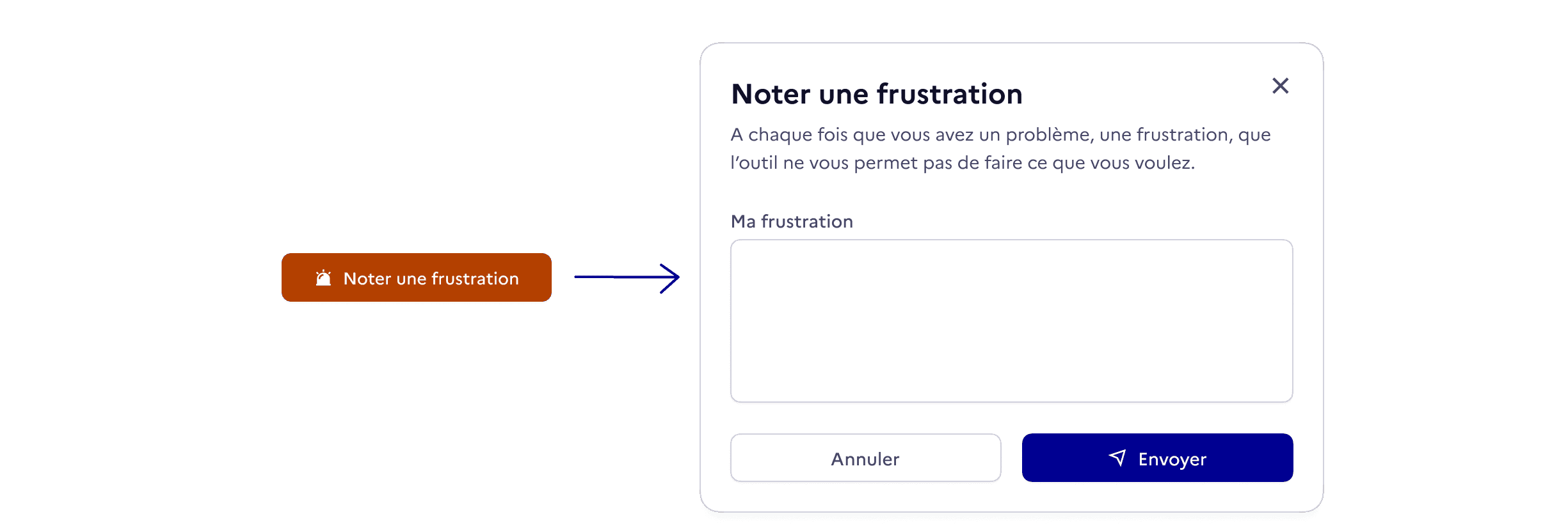
Feedback button

User testing has its limitations, as it does not reflect broader, everyday use. As a complementary solution, I added a clearly visible “Report a frustration” button that makes it very easy to submit feedback. Over time, this will help us identify and resolve user experience issues.

  • View

    more projects

  • View

    more projects

  • View

    more projects

  • View

    more projects

Index

Designing a web app from an Excel spreadsheet to make agents’ work more efficient

French Ministry of the Economy

3 months

Refonte ergonomique

Design d'interface

Application métier

Case study overview

Answer

Best viewed on a larger screen!

Context

The General Secretariat of the French Ministry of the Economy launched a plan to modernise its operations through cultural change, digital transformation, and infrastructure upgrades. To track the actions being implemented, a performance indicator index was created in an Excel spreadsheet.

However, Excel lacks essential features: multiple users cannot edit the document simultaneously, there is no permissions system, and so on. This is why the Transformation Lab, of which I am a member, was asked to create a dedicated web interface.

Problems to solve

Seul designer missionné sur ce projet, je vais designer de zéro un nouvel outil.

Le document de travail actuel n'est pas optimisé pour les tâches des agents sur ce projet, Excel n'étant pas conçu pour ça. L’objectif de ma démarche : répondre plus précisément aux besoins des agents en créant une interface réellement adaptée.

En analysant le document et en parlant avec les utilisateurs, voilà ce qui en ressort :

Readability

Agents have to navigate a large amount of data presented in an unsuitable format.

Efficiency

They waste time on repetitive, manual tasks due to a lack of optimisation.

Errors

The lack of rules and safeguards in Excel creates a risk of handling errors and data loss.

How can we make a large amount of data easier to read every day?

1. Reorganising information

The spreadsheet format requires users to scroll horizontally across very long rows. Each row is difficult to scan during everyday use, and essential information is sometimes hidden at the far end.
Since the data is not intended to be compared from one indicator to another, this format is unsuitable. I designed a hybrid layout that only requires scrolling in one direction and makes it much easier to get an overview.

2. Reducing cognitive load

By deprioritising information that is less important in everyday use

and would otherwise take up space and make scrolling less efficient.

By making the application easy to scan

Clear hierarchy and grouping through spacing, contrast, and type sizes; icons that support quick reading; a streamlined UI; and consistent visual design.

By designing a multi-step form

Less visually overwhelming and more fluid than manually filling in a new row in Excel.

How can we make the process more efficient?

1. Automatically displaying and updating an indicator’s status

An indicator’s status is essential information and is visually prominent in the application. It depends on the date of its latest update and the deadline for updating it again. In the Excel spreadsheet, this status was not displayed explicitly. Users had to manually check the different columns that determined it to find out whether they needed to take action.

2. Providing search filters

It is, of course, possible to create filters manually in Excel, but not every user thought to do so. Here, I displayed the relevant criteria directly, helping users find indicators more efficiently or sort them for a particular task—for example, identifying which indicators have not been updated.

3. Simplifying data entry

In the original working document, users often had to enter every piece of information manually—even when the available choices should have been limited. Wherever appropriate, I replaced text fields with dropdown menus, selectable chips, and other suitable controls.

How can we prevent errors?

1. Adding validation rules

To improve consistency, simplify data processing, and prevent errors:

2. Protecting data integrity

Outdated indicators and sub-indicators can be archived and hidden to improve readability, while their data is preserved.

This goes hand in hand with a dedicated interface for administrators, who can add or archive options used to define indicator attributes.

3. Adding friction to certain actions

Such as archiving an indicator or leaving the creation form.

Creating a UI kit

The French government has its own Design System. However, at the time of this project, it was not well suited to our needs, as it was primarily designed for government websites rather than applications.

While designing the application, I reused as many elements from this Design System as possible—including icons, the Marianne typeface, accent colours, and certain components. I also took the opportunity to create Transfokit with future reuse in mind.

I created flexible components using Component Properties.

Design tokens, light/dark modes

User testing

Once the first version of my design had been developed, I conducted task-based user testing to assess how well users understood the interface, how easy it was to learn, and how effectively the solution worked.

The identified improvements were implemented before launch, and the tool has since replaced the existing solution.

Feedback button

User testing has its limitations, as it does not reflect broader, everyday use. As a complementary solution, I added a clearly visible “Report a frustration” button that makes it very easy to submit feedback. Over time, this will help us identify and resolve user experience issues.
  • View

    more projects

  • View

    more projects

  • View

    more projects

  • View

    more projects

Index

Designing a web app from an Excel spreadsheet to make agents’ work more efficient

French Ministry of the Economy

3 months

Refonte ergonomique

Design d'interface

Application métier

Case study overview

Answer

Best viewed on a larger screen!

Context

The General Secretariat of the French Ministry of the Economy launched a plan to modernise its operations through cultural change, digital transformation, and infrastructure upgrades. To track the actions being implemented, a performance indicator index was created in an Excel spreadsheet.

However, Excel lacks essential features: multiple users cannot edit the document simultaneously, there is no permissions system, and so on. This is why the Transformation Lab, of which I am a member, was asked to create a dedicated web interface.

Problems to solve

Seul designer missionné sur ce projet, je vais designer de zéro un nouvel outil.

Le document de travail actuel n'est pas optimisé pour les tâches des agents sur ce projet, Excel n'étant pas conçu pour ça. L’objectif de ma démarche : répondre plus précisément aux besoins des agents en créant une interface réellement adaptée.

En analysant le document et en parlant avec les utilisateurs, voilà ce qui en ressort :

Readability

Agents have to navigate a large amount of data presented in an unsuitable format.

Efficiency

They waste time on repetitive, manual tasks due to a lack of optimisation.

Errors

The lack of rules and safeguards in Excel creates a risk of handling errors and data loss.

How can we make a large amount of data easier to read every day?

1. Reorganising information

The spreadsheet format requires users to scroll horizontally across very long rows. Each row is difficult to scan during everyday use, and essential information is sometimes hidden at the far end.
Since the data is not intended to be compared from one indicator to another, this format is unsuitable. I designed a hybrid layout that only requires scrolling in one direction and makes it much easier to get an overview.

2. Reducing cognitive load

By deprioritising information that is less important in everyday use

and would otherwise take up space and make scrolling less efficient.

By making the application easy to scan

Clear hierarchy and grouping through spacing, contrast, and type sizes; icons that support quick reading; a streamlined UI; and consistent visual design.

By designing a multi-step form

Less visually overwhelming and more fluid than manually filling in a new row in Excel.

How can we make the process more efficient?

1. Automatically displaying and updating an indicator’s status

An indicator’s status is essential information and is visually prominent in the application. It depends on the date of its latest update and the deadline for updating it again. In the Excel spreadsheet, this status was not displayed explicitly. Users had to manually check the different columns that determined it to find out whether they needed to take action.

2. Providing search filters

It is, of course, possible to create filters manually in Excel, but not every user thought to do so. Here, I displayed the relevant criteria directly, helping users find indicators more efficiently or sort them for a particular task—for example, identifying which indicators have not been updated.

3. Simplifying data entry

In the original working document, users often had to enter every piece of information manually—even when the available choices should have been limited. Wherever appropriate, I replaced text fields with dropdown menus, selectable chips, and other suitable controls.

How can we prevent errors?

1. Adding validation rules

To improve consistency, simplify data processing, and prevent errors:

2. Protecting data integrity

Outdated indicators and sub-indicators can be archived and hidden to improve readability, while their data is preserved.

This goes hand in hand with a dedicated interface for administrators, who can add or archive options used to define indicator attributes.

3. Adding friction to certain actions

Such as archiving an indicator or leaving the creation form.

Creating a UI kit

The French government has its own Design System. However, at the time of this project, it was not well suited to our needs, as it was primarily designed for government websites rather than applications.

While designing the application, I reused as many elements from this Design System as possible—including icons, the Marianne typeface, accent colours, and certain components. I also took the opportunity to create Transfokit with future reuse in mind.

I created flexible components using Component Properties.

Design tokens, light/dark modes

User testing

Once the first version of my design had been developed, I conducted task-based user testing to assess how well users understood the interface, how easy it was to learn, and how effectively the solution worked.

The identified improvements were implemented before launch, and the tool has since replaced the existing solution.

Feedback button

User testing has its limitations, as it does not reflect broader, everyday use. As a complementary solution, I added a clearly visible “Report a frustration” button that makes it very easy to submit feedback. Over time, this will help us identify and resolve user experience issues.

  • Voir

    d'autres projets

  • Voir

    d'autres projets

  • Voir

    d'autres projets

  • Voir

    d'autres projets

Create a free website with Framer, the website builder loved by startups, designers and agencies.