
The challenge
During the second year of my Master’s at Gobelins, three designers, myself included, and three developers teamed up to work on a SaaS project.
It all started with Camille, a Product Designer preparing for a long trip across several countries. She felt overwhelmed by the administrative tasks, practical preparations, and itinerary planning. Information was scattered across the web, her to-do list kept growing, and she could not find a suitable tool.
That gave us our starting point:
Exploratory research
One person's experience is not representative. We wanted to confirm there was a genuine need, understand exactly who shared it, and explore the topic in greater depth so we could respond appropriately.
Interviews and document analysis
Together with the other designers, I wrote an interview guide. We then recruited people preparing for a long trip, across several countries or around the world, as well as people who had already completed one. We asked about itinerary choices, organisational challenges, transport, tools, criteria, and more.
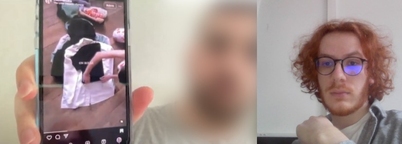
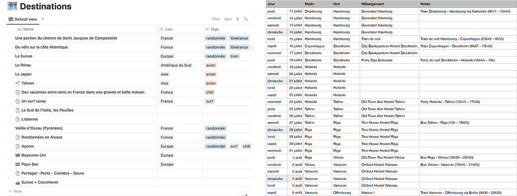
We asked participants who had already travelled to show us the documents they had used, such as Notion workspaces and Excel spreadsheets.
Key findings:
Competitive analysis
On one side, mainstream apps for bookings, itineraries, and checklists
…which cover only parts of the journey and are not designed for our niche or target audience.
On the other, more comprehensive tools
…which are either not optimised for travel or were not designed for it in the first place.
Primary audience
The interviews helped us define who we were designing for and support our future design decisions:
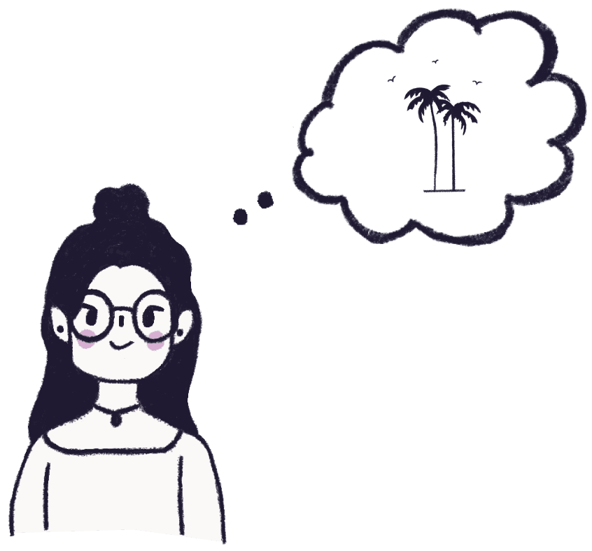
Goal: organise a complex trip while staying on top of everything
Needs guidance and support to make planning easier
Solution
Based on our research, we designed Odyssey, a web app that makes long, multi-country trips as simple and seamless to organise as possible.
Our main goal was to reduce the complexity of planning these trips by centralising all the essential information users need, giving them an all-in-one workspace tailored to the task, and automating part of the process.
The three of us collaborated on every Odyssey interface. Here are the areas I worked on:
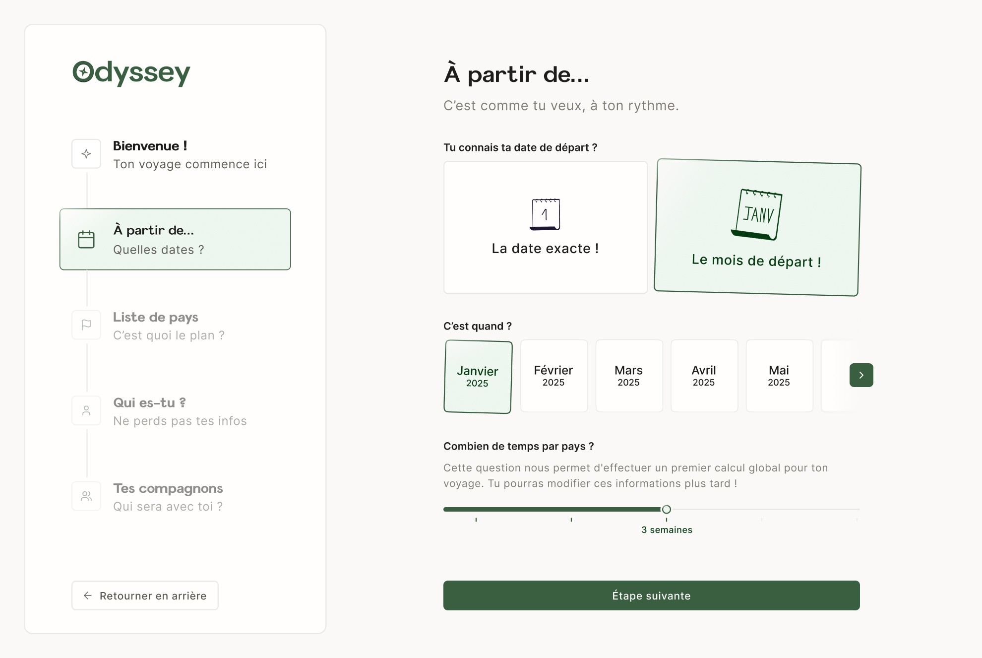
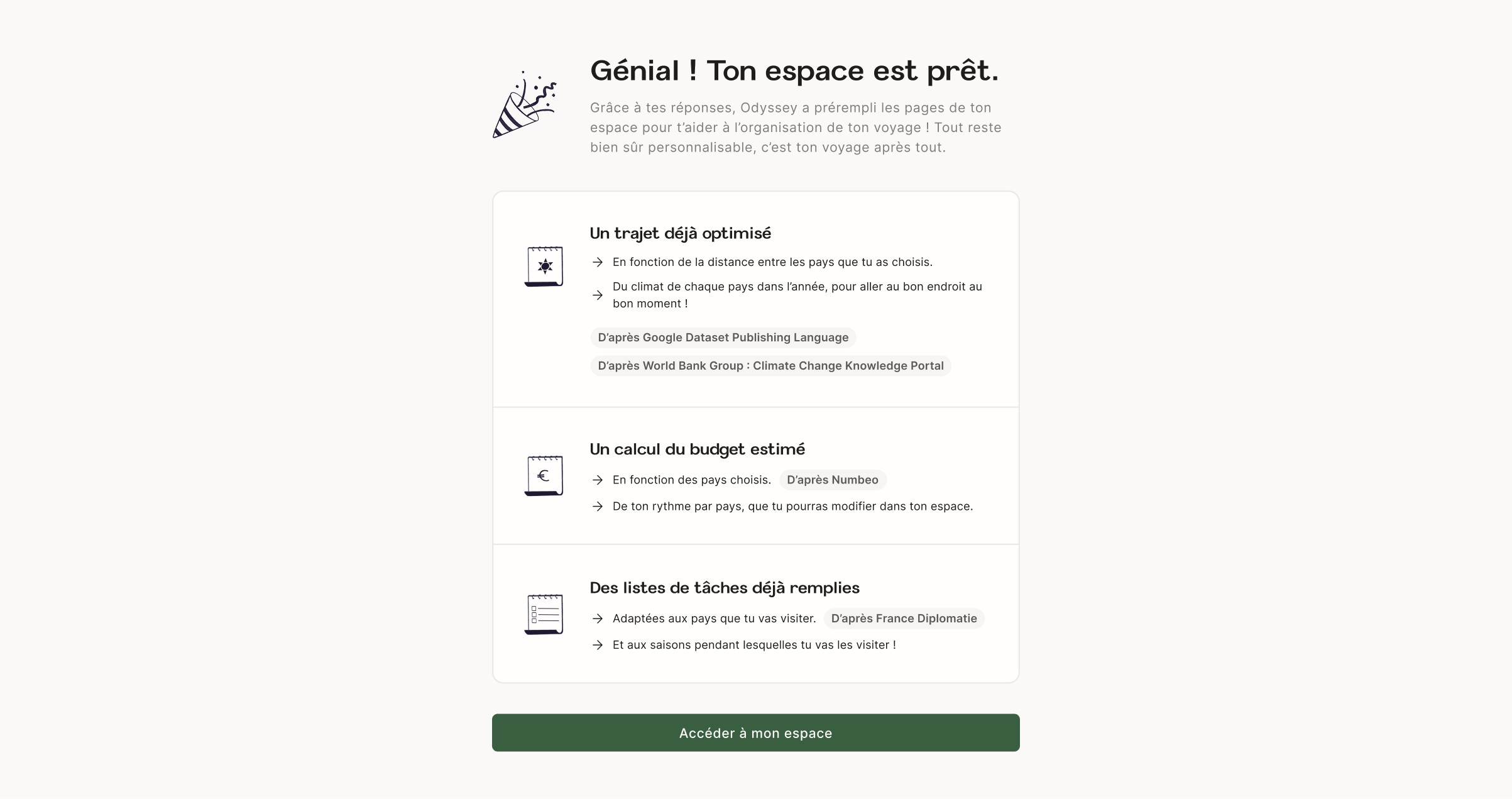
Onboarding: saving time through automation
Using the data collected during onboarding, Odyssey pre-fills several parts of the app, including an itinerary draft and tailored checklists.
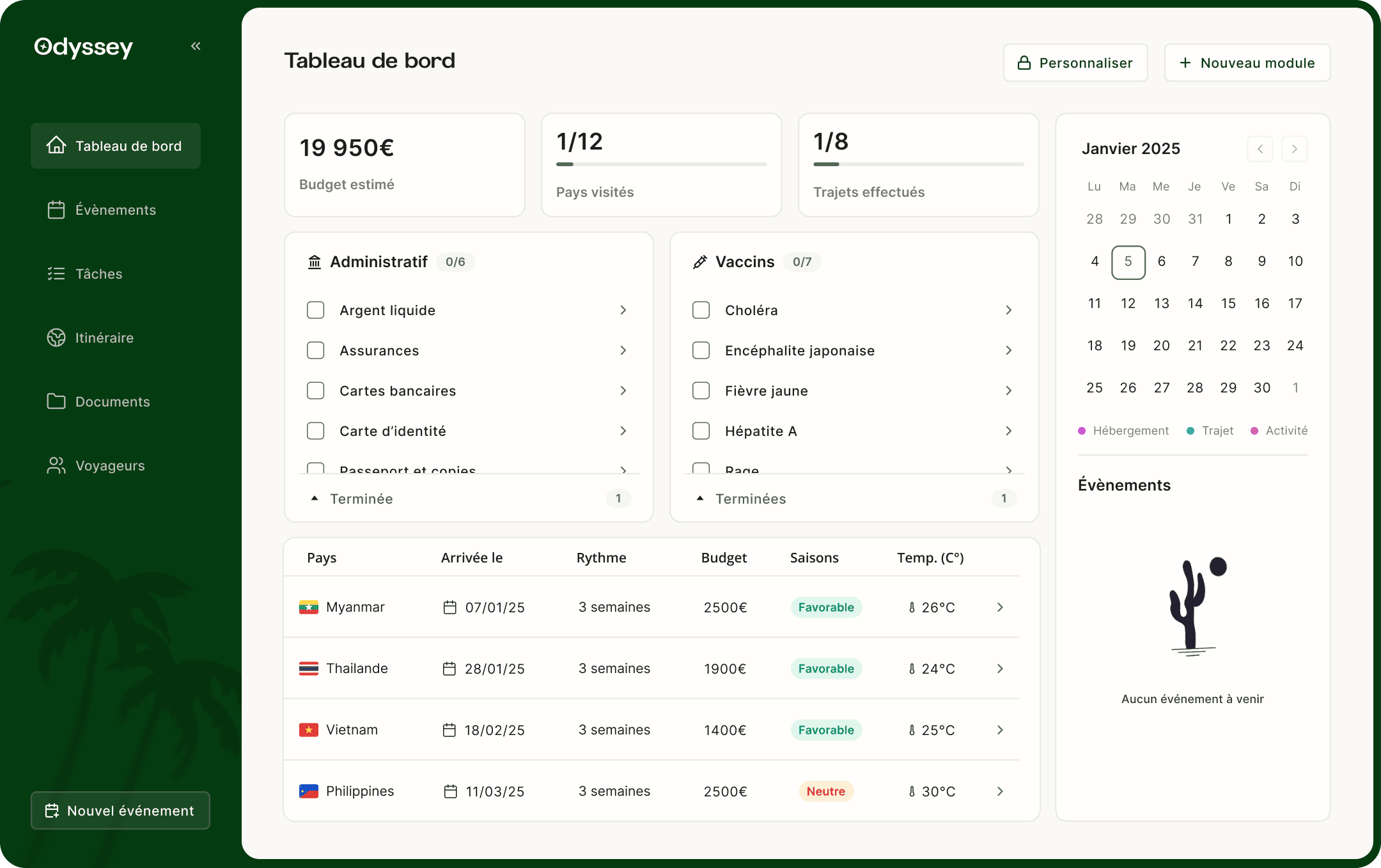
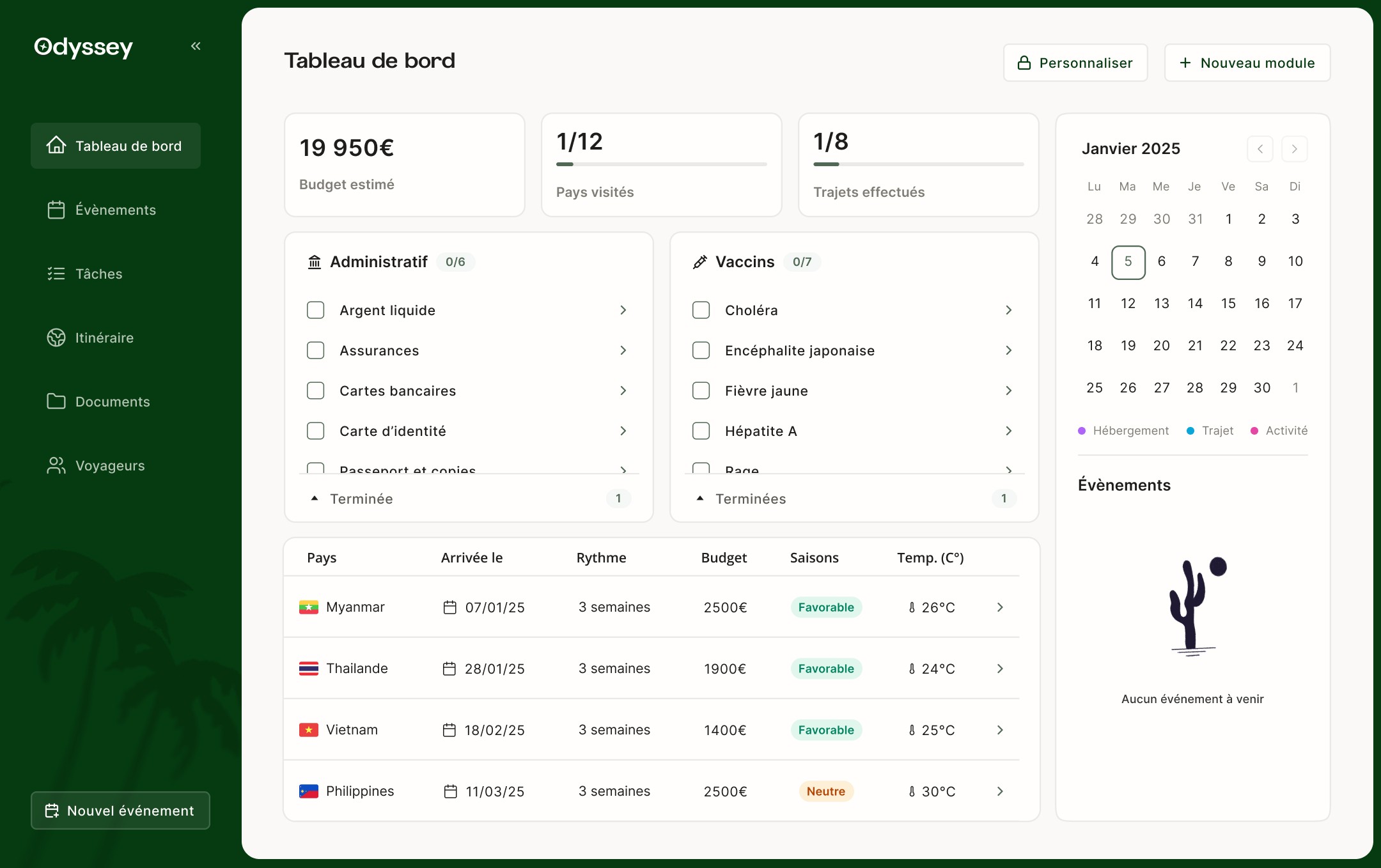
Dashboard: quick access to key information
Most items on the dashboard are shortcuts to other pages, surfacing their most important details.
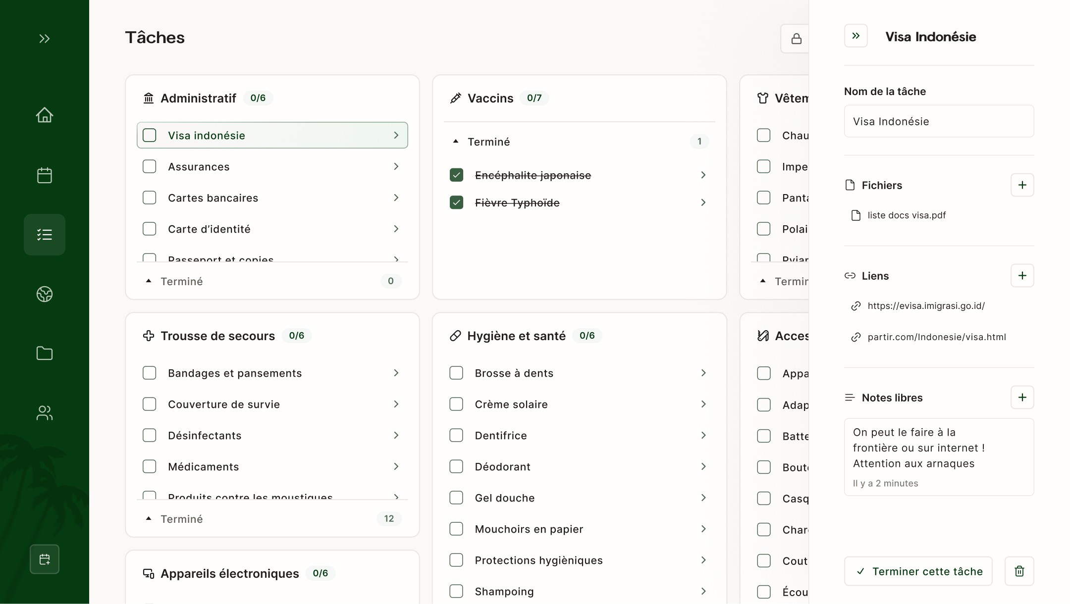
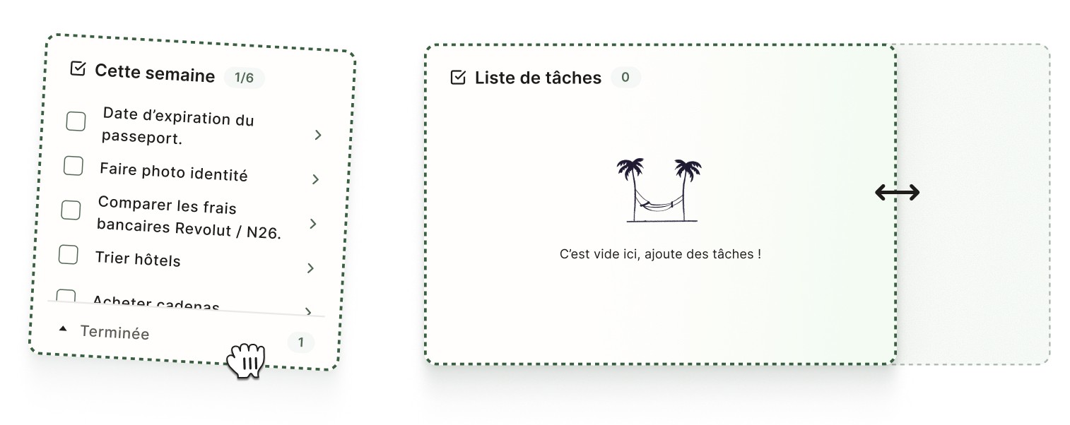
Tasks: a flexible space tailored to each trip
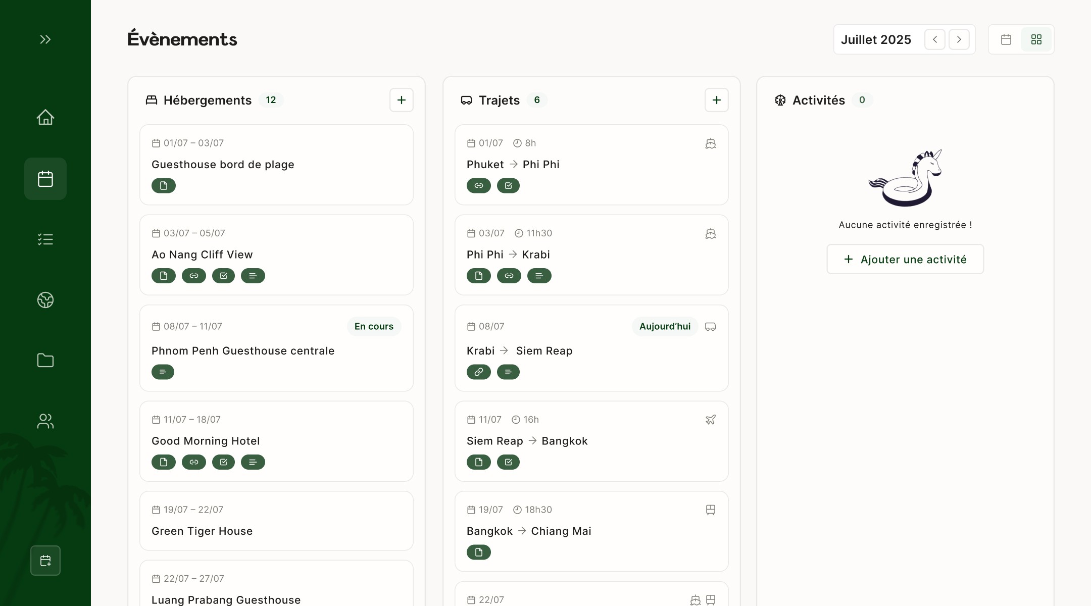
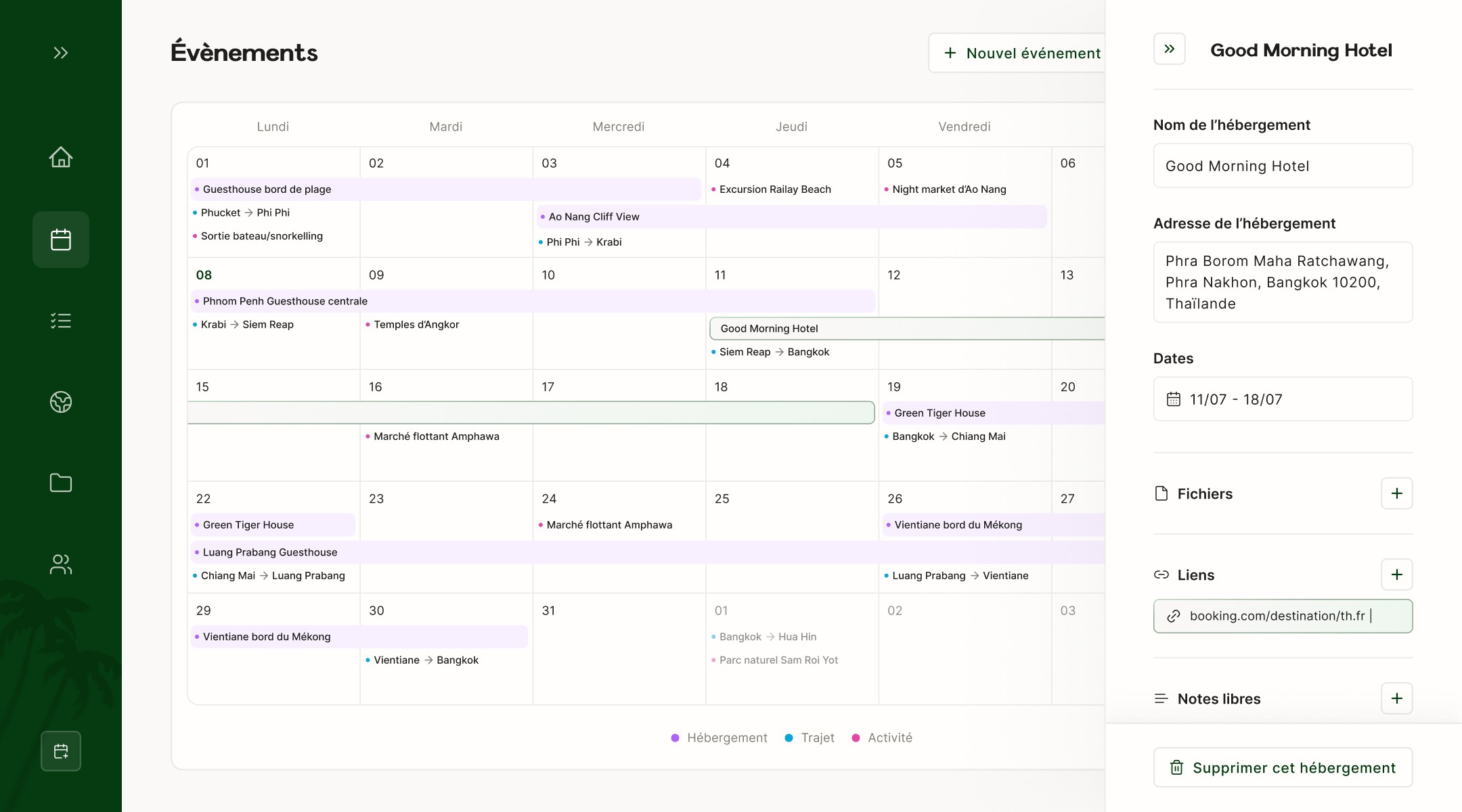
Events: views and options designed to save time
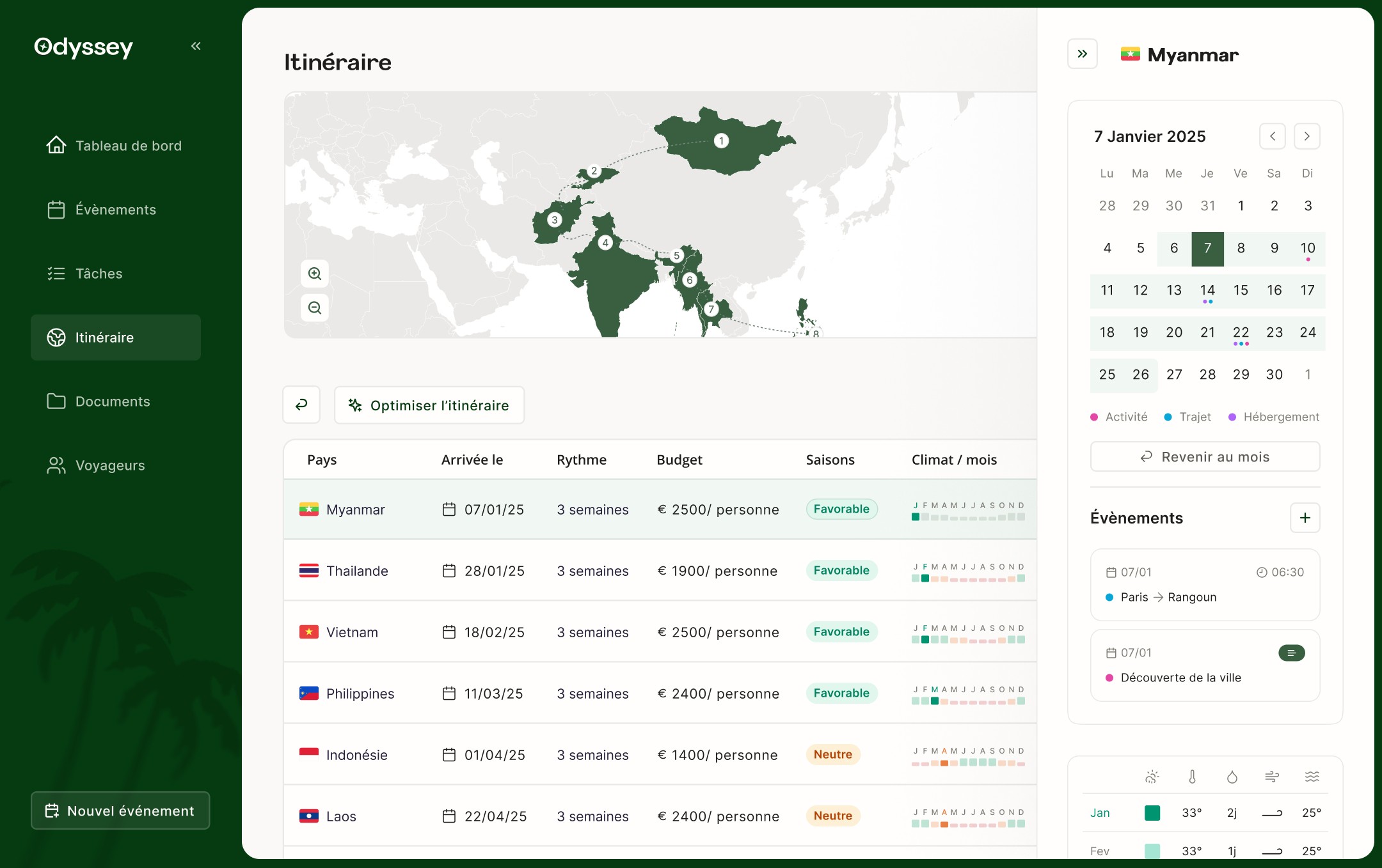
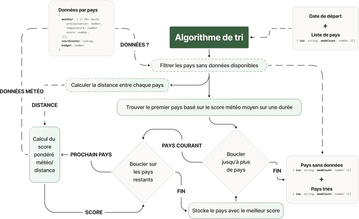
Itinerary: an interface and algorithm that guide users

User testing
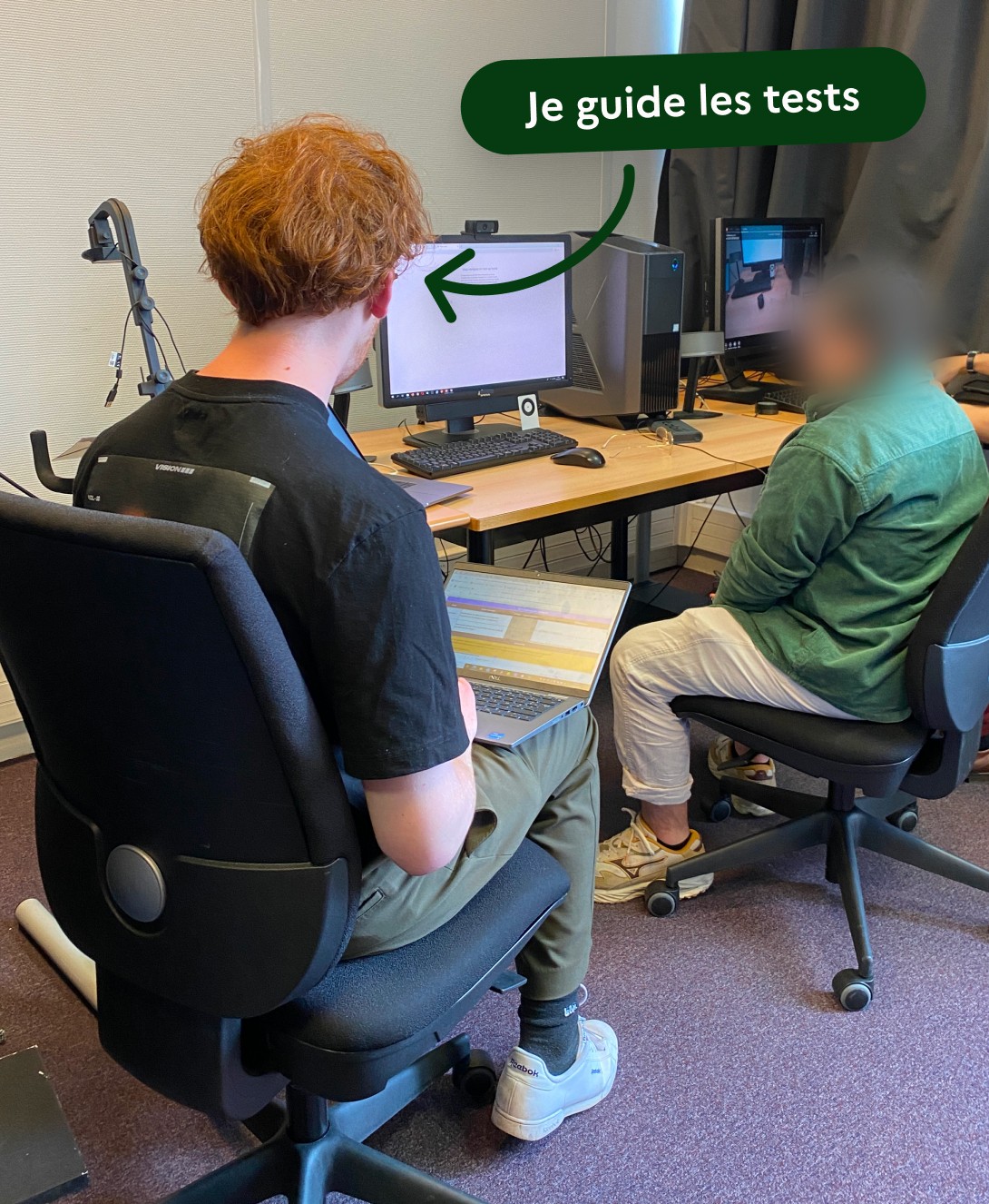
We tested Odyssey's interfaces early to validate their usability and avoid creating technical debt.

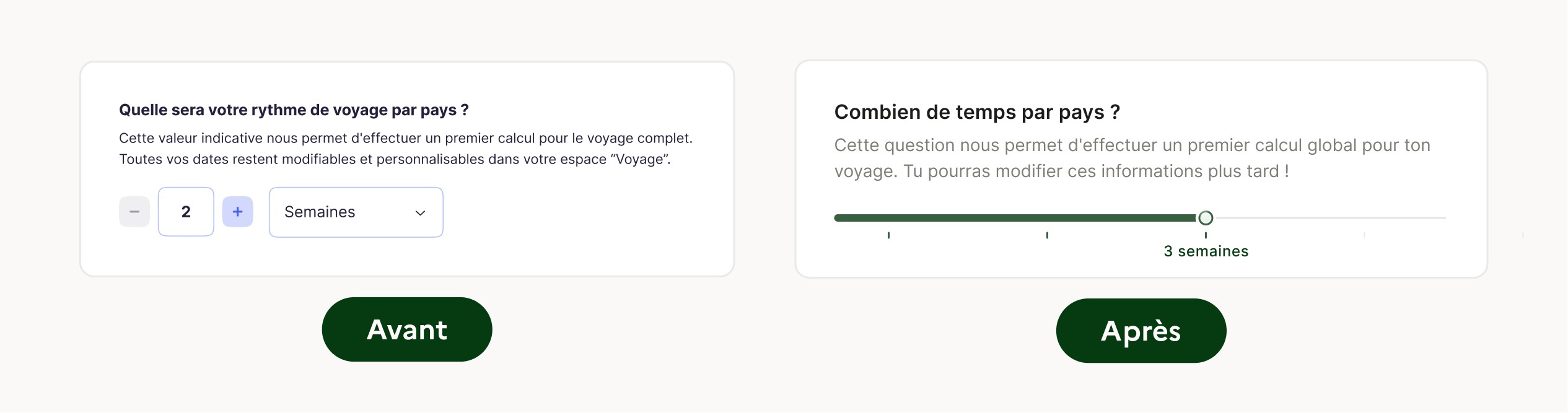
Choosing a travel pace
The interaction was not intuitive and users stumbled over it: choosing both a number and a unit required several clicks and decisions, disrupting the flow of onboarding.
Solution:
Make the interaction more visual and engaging with a slider: a single action using a more appropriate time scale.
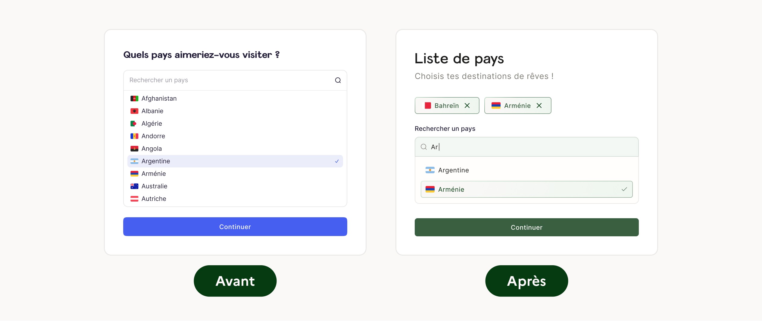
Choosing countries
Selected countries appeared only inside the dropdown, making previous choices hard to see. Users were unsure what they had already selected, which caused confusion and made quick edits difficult.
Solution:
Show selected countries at the top of the dropdown. This makes choices clearer, simplifies removing a country, and speeds up form completion.
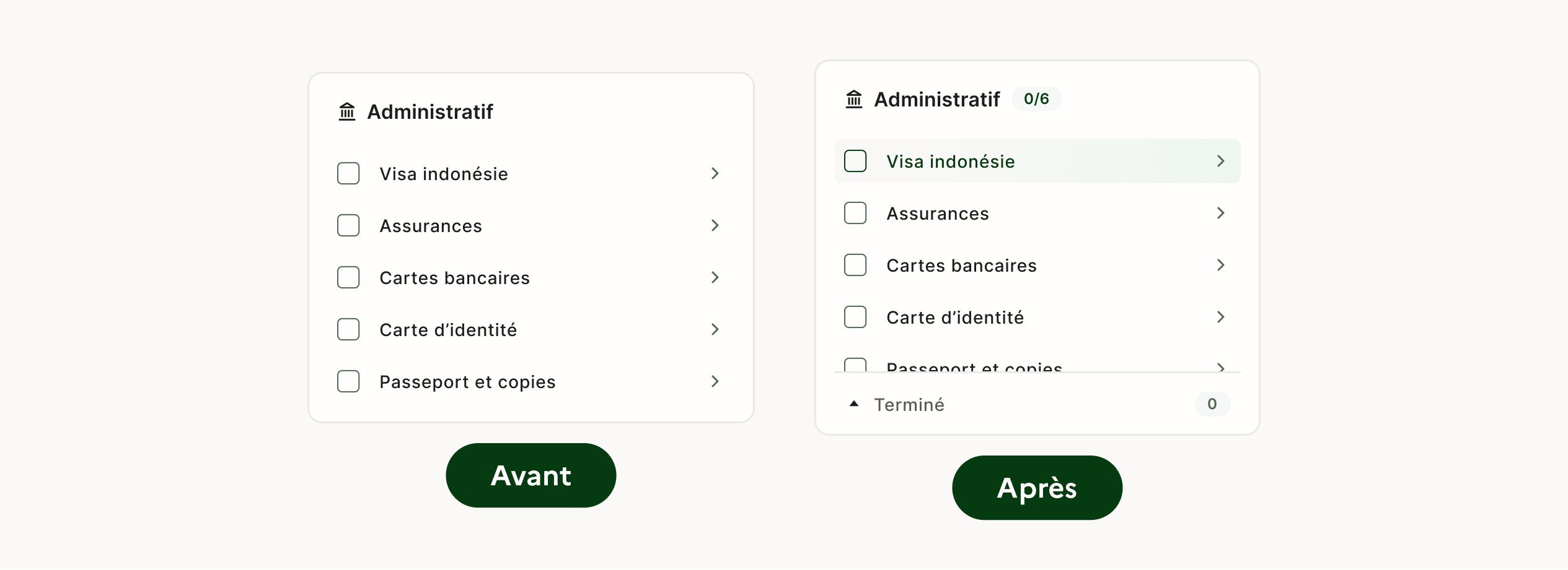
Checklists
Several users did not realise that tasks could be checked off, while others could not find tasks hidden below the fold.
Solution:
Improve affordance with hover states, and hint at tasks hidden below the fold by leaving them partially visible.
Collaborating with developers
Throughout the project, I also did everything I could to help the developers build the application more easily and efficiently.